What is a Vertical Bar Graph?
Vertical bar graphs display the information visually using vertical bars or columns. In mathematics, graphs are used to present information in the form of a visual model.
For example, let’s say we have a table that shows the number of chocolate bars Joe and her friends bought.

Now, how do we tell who has the most number of chocolates?
We go through the table and find the greatest number. That is 10. We look at the name corresponding to this number, and we get our answer. Jack has the most number of chocolates.
Now, what about who has the least number of chocolates? We look at the table and find the smallest value in the column named “number of chocolate bars,” and this value is 3. We look at the name, and it’s Harry. So Harry has the least number of chocolates.
Now, what if instead of having to go through the table again and again, we had a visual model?
Vertical bar graph example: We can represent the above table as a graph. The given image shows a single vertical bar graph. (In some cases, multiple vertical bars are required for multiple parameters in the data, but we will discuss graphs with single vertical bars.)

To answer the questions, we could just find the biggest and the smallest bar and find the answers quickly without having to skim through the table again and again.
This type of model is called a vertical bar graph. We use a vertical bar graph to represent categorical data visually and to make inferences as per our requirements.
But how to make a vertical bar graph and compare/analyze the observations? Let’s find out!
 Begin here
 Play
Play
 Play
Play
 Play
Play
 Play
Play
 Play
Play
 Play
Play
 Play
Play
 Play
Play
 Play
Play
 Play
Play
Vertical Bar Graph Definition
A vertical bar graph is a graph that displays data using vertical bars. Vertical bar graph is also known as vertical bar diagram or vertical bar chart or column graph.
The length or height of the bars is proportional to the quantities they represent. We usually create a vertical bar graph when we have data like the table above. We have some names and we have some numbers that represent particular information corresponding to each name, like the number of chocolate bars each person has.


Drawing a Vertical Bar Graph
Let’s try converting the table above into a vertical bar graph.
- First, take a piece of paper and draw two perpendicular lines called axes. The horizontal axis is the x-axis, and the vertical axis is the y-axis.

- Now, mark the name of the people on the x-axis. We mark numbers on the y-axis and the categories or names on the x-axis.

- Start drawing the bars. We first look at the number of chocolates that Joe has, which is 7. So we will create a vertical bar starting from the x-axis right above where we have written “Joe,” up to the number 7 on the y-axis like this:

- Continue creating the bars for other people, and the completed graph will look like this. Make sure that all the bars are parallel to each other.

Analyzing the Vertical Bar Graph
Now, using the graph, let’s see what we can find from this graph.
- Jack has the most number of chocolates, as the bar for Jack is the longest.
- Lily has 9 chocolates as her bar touches the line corresponding to nine chocolates on the x-axis.
- Harry has the least number of chocolates having the shortest bar.
- Lily has the second-most number of chocolates after Jack among Lily, Harry, and Joe, as she has the longest bar among all three.
The Scale of a Vertical Bar Graph
Sometimes, when the numbers are too big, we use scaling to draw the graphs easily. For instance, let’s consider this example:
Joe’s school has 1500 students. Joe created an online survey to know about the different modes of transportation that the students use. The following table summarizes her findings:

Let’s try converting this data set into a vertical bar graph. However, is it possible to mark numbers all the way to 500 on the y-axis? It isn’t. Therefore, we must use an appropriate “scale.”
Scale Definition
In simple words, a scale is a set of numbers that help to measure or quantify objects. A graph scale shows how the numbers or pictures are used in data. The size of the bars in a bar graph is proportional to the quantity it represents, and this proportion is called scale. Instead of writing all the numbers on the graphs, we can write the numbers by skip-counting from an appropriate number and representing the data using this scale.
Drawing a Vertical Bar Graph Using an Appropriate Scale
Let’s now convert the above data into a vertical bar graph. First, let’s establish an appropriate scale. Since most of the numbers in the table are multiples of 100, we will keep multiples of 100 as our scale. The distance between two numbers indicates a unit: this unit remains uniform throughout a scale. The bars for “metro” and “others” will only reach halfway between 0 and 100 on the y-axis because 50 is half of 100.

Conclusion
A vertical bar graph is a data representation technique that depicts the data using vertical rectangular bars. It makes comparison and data analysis easier. The bars along the vertical axis represent a numeric value, and the horizontal axis represents a non-numeric value.
Solved Examples
1. The below table shows the students attending a monthly test for different subjects. Convert it into a vertical bar graph.

Solution: In this example, the number of students attempting the subject test for each subject are above 80. So we will start our scale with a number less than 80 and keep each number at a distance of 2 units to help create a good visualization of the data.

2. Observe the below graph. It shows the favorite color of 120 students in Grade V.

(a) Which is the most preferred color?
(b) Which two are equally preferred colors?
(c) How many students prefer green?
Solution:
(a) White
(b) Yellow and blue
(c) 30
Practice Problems
Vertical Bar Graph
Observe the graph below. It shows the number of absentees in a class.
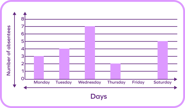
The Wednesday bar is the longest among all in the graph. So, the number of absentees was the highest on Wednesday,
The graph shows the number of apples, oranges, and mangoes in Joe's home. Which fruit is present in maximum quantity?

From the graph, there are 30 oranges and 30 mangoes in Joe’s home.
Observe the graph given below. It shows the number of cars manufactured by a car manufacturing company on different days of the week.
How many cars did the company produce on Saturday and Sunday combined?

As we can see in the graph, the company did not manufacture any cars on Saturday and Sunday.
Frequently Asked Questions
The horizontal axis or x-axis of a vertical bar graph represents non-numeric data, while the vertical axis or y-axis of a vertical bar graph represents numeric data.
Why are bar graphs important?
Bar graphs will help you convert raw data into visually comparable bars for easy comparison and analysis.
What is scale?
The size of the bars in a bar graph is proportional to the quantity it represents. We call this proportion “scale.” It represents the length of a unit in the vertical bar graph in relation to the actual quantity.